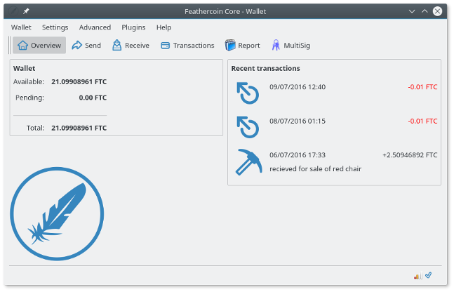
[Dev] Release Candidate Feathercoin 0.9.3.2 - Check List
-
I think all test cpp file are bitcoin not feathercoin. When I compile with disable-tests, I don’t think we can use it .
-
I think the auto test system is relevent, or should be. Other coins such as Dogecoin have fixed their tests.
Do we need to update the test data to make them Feathercoin specific?
-
@lizhi said in [Dev] Release Candidate Feathercoin 0.9.3.2 - Check List:
I think all test cpp file are bitcoin not feathercoin. When I compile with disable-tests, I don’t think we can use it .
Yeah I believe so to.
With some of the tests, it has hard coded strings that I believe relate to Bitcoin, like some hard coded private keys for testing etc. I’m sure those need to be changed to relate to Feathercoin.
-
Then we should adapt the tests to feathercoin.
We could avoid problems like the sync problem we had with 0.9.3.2, if we have suficient tests coded.
Tests that we need to have:- switch to block version 2
- select the first 5 or 10 blocks with block version 2 and see if the code accepts the blocks
- switch from 2.5 minute time to block to 1 Minute time to block
- select the last 5 blocks bfore the fork and after the fork and check, if the code accepts the blocks
- switch to neoscrypt
- select the last 5 blocks bfore the fork and after the fork and check, if the code accepts the blocks
Probably there are more, but these are important ones and can be done without interaction with other clients.
in additon we should replace the bitcoin specific tests with the Feathercoin equivalents.
- switch to block version 2
-
A friend of mine who does graphic art is helping do a subtle and “tested with different Desktop Themes” update to the wallet.
The graduated background image was not tilling well, so we will be testing some alternatives. Here is the first test of white with a blue logo, matching the forum.
I’ve set him up a development environment and we have now found all the places / images need to be adjusted to try make some improvements …
We also have also produced a Green alternate that matches the Chinese FTC forum that colour scheme that @Lizhi runs, that he could include in his window builds.
At the moment the priority is to replace the background screen with a more subtle look.
We have been discussing ideas such as to use the shadow from the FTC graphics library, and have the Logo as “Water mark”.
I’ve made a Github, for swapping test images :
https://github.com/wrapperband/FTC-Wallet-Layout-ExamplesFeathercoin wallet overveiw with White background image & Forum Blue Logo
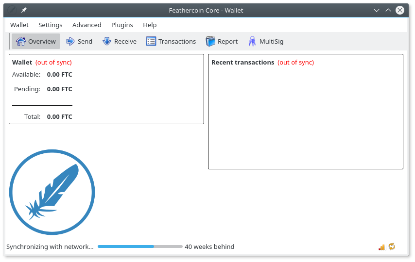
There is a resource directory with the current graphics files from Feathercoin/src/qt/res/images including any new or possible options.
https://github.com/wrapperband/FTC-Wallet-Layout-Examples

-
Love that new look. It looks cleaner.
How about have a few colours and have the user pick their fav. The default one should be blue and matching the forum…that matching idea was a great idea.
If you can use the forum icons in the wallet as well or get an icon set together and use them for both ?
Exciting time ahead !!!
-
You can find the standard graphics and vector versions here :
Feathercoin Graphics and Logos : https://www.feathercoin.com/feathercoin-graphic-resources/
I’ve added a new section to the Wallet guide to point to external features such as graphics :
Links, External features and further information
Feathercoin forum : find support
http://forum.feathercoin.com/category/18/support
Feathercoin Block Explorer
http://explorer.feathercoin.com/chain/Feathercoin
Feathercoin API
The Feathercoin API is a set of function calls you can make to the Feathercoin server to return the status of various parameters, such as difficult, block height
https://www.feathercoin.com/feathercoin-api/
Using Feathercoin with other Cryptographic currencies, pchMessageStart
In most circumstance, alternative currencies coexist on a system by their name and the port they communicate on. When exchanges or pools deal with multiple currencies they can use pchMessageStart to destinguish between them.
Feathercoin was originally forked from the Litecoin project and shared the same pchMessageStart. in order to identify Feathercoin a second pchMassageStart was added which Feathercoin will use preferentially,if given.
Feathercoin specific pchMessageStart
0xfe 0x46 0x54 0x43
Feathercoin Graphics and Logos
https://www.feathercoin.com/feathercoin-graphic-resources/
Feathercoin Merchent tools
Website Button generator.
https://www.feathercoin.com/feathercoin-button-generator/
Broadcast Transaction Service
Feathercoin Broadcast Transaction Service :
block.ftc-c.com/tx/sendIf you wish to accelerate a transaction getting onto the blockchain or it is a stealth transaction, you may wish to us the Broadcast service.
How to use the broadcast service :
First Step : Find your transaction binary code :
feathercoind.exe getrawtransaction 53519a8f97038728a72a80bcc4d07919165617deb2142e588a9dca6e95d43043

0100000002c2936c0ccf2b2ab10740ee769ac10739da513d508f500e7ec9294617d62a94c2000000006a473044022002ed821998221aebc12bb994c00a8f9e6a6d8132ef0ae0d237dc31b01c54be6a022027d574128ac65ea1ec25a37c715bddba15f4827980b11ad6246bc933a50785f6012102c5a97cc1094c30da8351d5b288b7c89e375361eef6c947e7f671c26f9a6e3a3bffffffff2de0b2e003f5147ef8152bacacee9a481786a04c5e202fa7f0577fc9cc3b2702000000006b4830450220693e02092dc4eeb53abeaa834c05624f223aa09bb75858607f72b1d41a5ce47902210097075c48ccaa5088c0c563e4334400954bd127580d3753420b79b83d57e3caa6012103652bc983297937e0ceaf72eabad43ea3123333e85430332bcb4da37bcc3e59c7ffffffff0280969800000000001976a914affb568d0a05e0be72b682c7ced6bf2ca064870288ac0000000000000000236a21028726aae1c0ffe6138b70284519f09266f1ab6d7d7e4511f1a1d359045f26d42a00000000
Second Step : Broadcast it :
Go to http://block.ftc-c.com/tx/send

copy binary code , click “Send transaction” .
Wait confirmation, until a mining pool makes a block.
Advanced Checkpointing ACP
What is Advanced Checkpointing?
Advanced Checkpointing allows Feathercoin to send out checkpoints without having to release a new version Feathercoin software. This works by having ‘master nodes’ which checkpoints each block it sees on the network protecting it from specifically from being double spent.
The ACP checkpointing for Feathercoin has been set at every 5 blocks. ACP does not dictate the blockchain, it provides checkpoints and helps prevent double spends, if the checkpoint is on a short branch it will be rejected.
-
-
@wrapper
Can we make the look ‘user changable’?I’ve opened an enhancement request some month ago on github already.
It shouldn’t be to compilcated
-
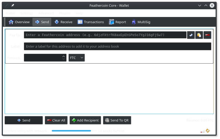
This is the result of testing the White background with a KDE dark theme, it will need at least a slight grey, which would still not show dark themes great.
An enhancement would be to look how the backgroud should be done,; Currently if a transparent image is used, the background shows black ( with a light desktop theme. )
https://wiki.qt.io/How_to_Change_the_Background_Color_of_QWidget
Feathercoin wallet with Dark KDE Theme, White Back Ground
-
-
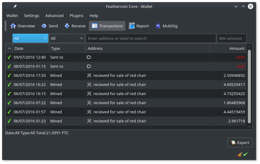
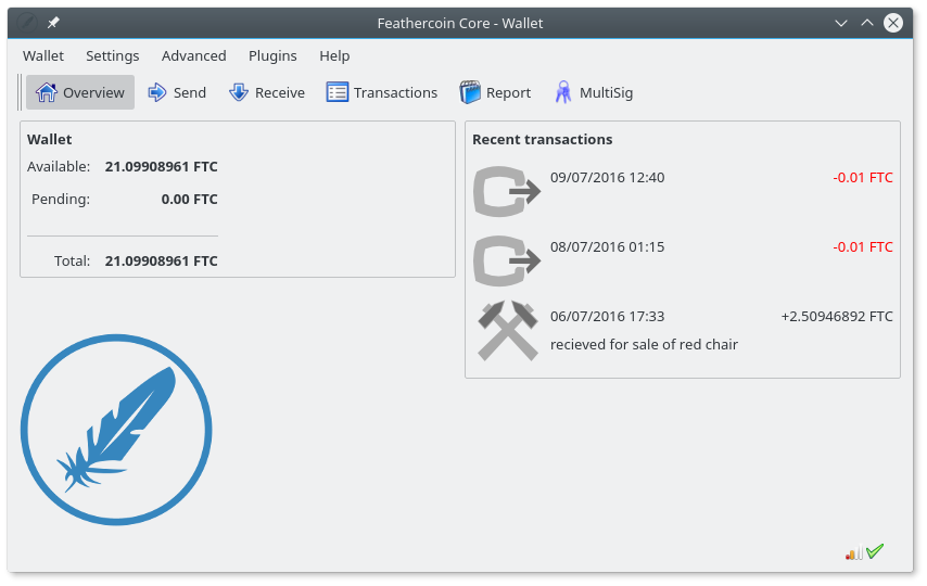
We’re experimenting with changes the UI code to remove the background image, it works better with a light grey background but is still incompatible with “Desktop Themes” :
Here is the Dark Theme now with code changes we made :
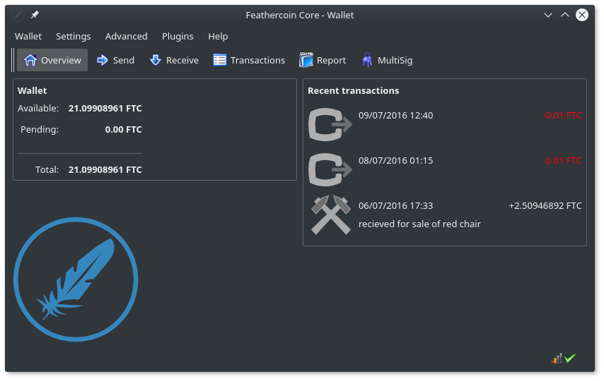
Here is the new transaction screen with Dark Theme showing correctly :
-
The next priority is to look at consistency of the dialog box, although we do want to try some other Logo ideas, the blue one is looking pretty neat, it’s clean, crisp, bright and mirrors the forum / project colours… …
We’re just experimenting with adding a frame around the status bar to define that better…
Here is how the Main screen now looks with the UI code changes.:
-
@wrapper the dark grey one looks nice and is like some dark themes available for the desktop
-
@uncle_muddy @Wellenreiter @Lizhi @MrWyrm @Aciddude @Ghostlander @RIPPEDDRAGON
Feathercoin-qt : Graphic User Interface, Development / Testing progress.
I have now spent a number of days going over the Feathercoin 0.9.3.2 GUI, how it is programmed, which files / variables / classes are involved.
AFB has assisted me and I have set him up a development environment.
We have done / identified a number of small changes, mainly removing things that weren’t done “generically”. We found yesterday, every time we made the system more “open” it looked better.
The Dark and Light theme are just KDE. We have done some work removing “specific” settings (eg mainbg.png) and doing the extra work to make the system be “Operating System Theme Aware”, then tested on various operating system themes.
We can understand now why this was awkward to customize the GUI code in the Feathercoin / Bitcoin core program.
It’s Qt widget uses the status bar (Statusbar()) at a higher (parent) level that the rest of the screen, which is handled by straight GUI coding. I think it’s because they need to pass information to the status at a parent level.
AFB and I both agreed, we’d have tried to make the status a graphics object that could be designed with style sheet and be removable by the user, like the toolbar.
That took us about 10 man hours to work out why we couldn’t put a box around the status bar, or why in the end it looked better without it.But then we need to add a line at the bottom of overview.ui - to differentiate the status bar on the main screen. The rest of the windows are already differentiated from the status bar).
It then takes 14 min’s to do a compile, to see how that looked, every time you make a change.
Results of tests
There are a lot of small changes need to finish that work, some of which we still need to study to see which method to apply across the program. Also, although it makes it a lot more difficult for AFB I have been insisting on documenting “failure” so the forum can appreciate why we are doing anything, or assist if they would like to.We have considered a number of other things such as, wither it is viable to add customization, like alternate “Feathercoin Logo” HOWEVER, AFB and I were still impressed how the “forum blue” Logo already fitted with system blues such as the status / progress bar, or button mouse over highlight, so we don’t want an option that takes extra work but makes it look worse.
A point of the Graphics work is to make sure it works across Distributions and even on windows or the MAC, so I will do the work to push intermediate changes to my Github Distro, in a form they can be pulled in by Wellenreiter, either to 0.9.3.2 or a new 0.9.6.2-GUI
What next
I will be continuing to implement some of the details we have already found and research how to do some more things in C++ and Qt. Currently we have replace the background image with common grey, the code that adds the image : needs removing, and the actual background set to OS system “default”.However, it did pass the Operating System Dark Theme test of KDE, so awaiting tests on other OSs. AFB suggested other artistic uses of the background, worth letting him review.
The other main work is improving the new forms and enforcing a common look and feel. Making the system use operating system defaults will help do that and automatically benefits from the “art work” the distribution put into those icons and effects. Investigate an alternative Light Blue Logo style.
We require the 0.9.3.2 Test versions to be built for Gnome, Unity, Windows and Mac etc, and reviewed now, and again when any significant further change has been included. Specifically looking at, Theme / icon compatibility. It is hoped to use system Icons, so it envisaged mods to specific icons may be required.
The splash screen needs a review in line with Light Blue Logo FTC default, and wither the Logo colour theme is going to be an option.)
Example UI improvement required
A common problem on all panes is that frame and button markers aren’t handled consistency with “mouse over”, some go blue others stay black. To be consistent with themes they all need to be system.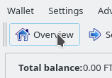
I’ve already done work in 0.9.3.2 to improve the new forms, that’s been pulled into the Feathercoin version.
I’ve also added help and more logically / reposition fields, however, all the new forms require lot more work to provide a consistent look and feel and basic frame sizing options.
AFB came up with an idea to simplify this Frame on the multisig wallet. It is also little things, we also spotted this, that need to be perfect to look good. :
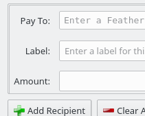
Information
Source Code with GUI review test changes / Logo
git clone https://github.com/wrapperband/Feathercoin
cd Feathercoin
git checkout 0.9.3.2Source Code Graphics Files are stored
/src/qt/res/imagesForm Design : view with Qt Creator.
/src/qt/overveiw.uiMain Graphics Widget initiation, status bar
/src/qt/bitcoingui.cppFeathercoin Graphics and Logos
https://www.feathercoin.com/feathercoin-graphic-resources/Graphics resources and reporting
https://github.com/wrapperband/FTC-Wallet-Layout-Examples -
Amazing work @wrapper !
-
Thanx @aciddue, I couldn’t have made the progress without AFBs help. I’ve been doing GUI background work, to make that happen, including bring AFB up to speed on where I was up to previously as well.
But as you know I am fragile physically with spine damage, we’ve done quites lot because we we’re making progress, I need a rest and AFB needs a chance to ponder what we’ve learned so far.
-
Here’s the Wallet Overviewpage.ui screen with a plain divider line added :
updated with divider line moved down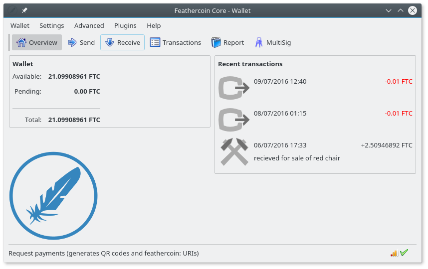
-
@AFB 's done a new Feathercoin bar logo, and we’ve improved the layout of the “About box.” Using a graduated image is a temporary solution. It would be nice / we’d like to have a logo on a drawn graduated background so the window would scale. Scaling is not a priority with the about box, but the techniques would be worthwhile to find how to achieve that in Qt/C++, as it could be applied to improve other panels.
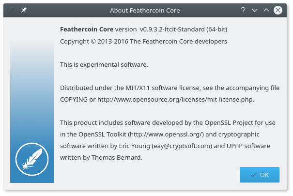
-
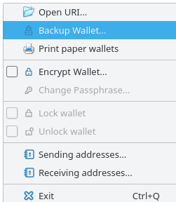
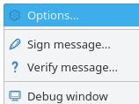
I’m just testing a build with the first part of an updated icon set AFB is developing :
New Icons on Wallet Menu
New Icons Settings Menu
New Button Icons, so far
